Stats Series|Beyond Percentages: A Simple Yet More Complete Picture of Group Differences

In education, we compare groups constantly. Who met the benchmark, who did not, who participated, who was left out. Percentages make those comparisons easy to communicate. This post makes the case for going one step further.
Very often, we default to comparing percentages when reviewing the differences between groups. For instance, when conducting comprehensive needs assessments, we would break down key performance indicators by student subgroups or program participation to see differences. If we put a more concrete example, we find 78 percent of students in the program met a specific benchmark, compared to 64 percent of students who did not participate. That would make someone happy because it seems like things are heading in the right direction. A 14-point positive difference is hard to ignore; if anything, we would celebrate it!
But then, when we look at the numbers (raw counts) behind those percentages, the program group had 18 students, and the comparison group had 312. Now we are not sure what to make of any of it and a couple of questions are coming to mind: Is that gap real? Is it meaningful? Would it hold up if you looked at a different group of students next year? Now we have lost the excitement and are back to square one. We do not have enough evidence to suggest one thing or the other.
In this post, I want to offer you one test statistic that is simple to perform, straightforward to interpret, and will also give you more accurate information regarding those proportions or differences between groups. Have I not lost you yet? Great, let’s keep going.
What percentages tell you
A percentage is a way of expressing a proportion out of 100. It tells us how many out of every 100 cases share a particular characteristic, making it easy to compare groups at a glance regardless of how many people are in each one.
A percentage is part of what we call descriptive statistics; simply put, it summarizes the composition of the data without transforming it. Percentages are useful when we want to describe the composition of a group, like how many students are enrolled, how they are distributed by gender, race, disability status, performance levels, and so on. But percentages have limitations; they do not tell us whether the difference between two groups is real or whether it is just noise produced by a small number of cases.
The problem gets more noticeable when the groups being compared are of different sizes, which in education is almost always the case. A program serving 20 students is being compared to a school population of 400. The percentage gap may look dramatic, but the underlying counts may tell a completely different story.
So, what other options do we have if we want to move the needle from descriptive to diagnostic levels of analysis? A simple test that examines proportions more rigorously is called the chi-square test. If you hated your research or statistics class, keep reading, because I promise you will love this one.
The test that asks the right question
A Chi-square is a test designed specifically for categorical data, meaning data that falls into distinct categories (groups) rather than continuous numbers. In education, categorical outcomes are everywhere: a student met the benchmark or did not, was proficient or was not, attended the program or did not. This test is built for exactly this kind of comparison.
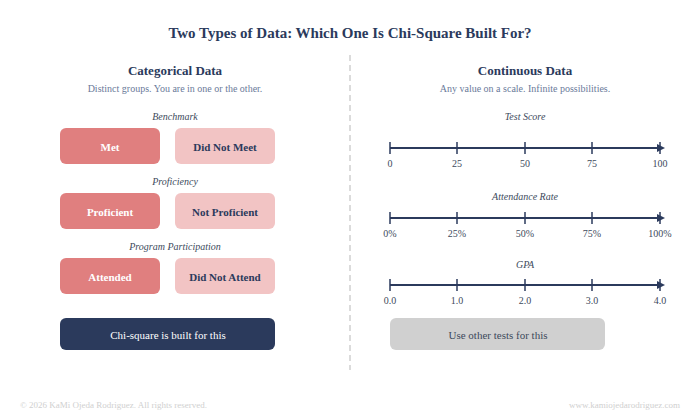
Categorical data falls into distinct groups with no in-between. Chi-square is designed for this type of data. Continuous data, like test scores or GPA, requires different statistical approaches.
Here is how it works in plain terms. Imagine a simple table with two rows and two columns: students who participated in the program versus students who did not, and within each group, how many met the benchmark versus how many did not. That gives you four cells with counts in each. The test compares what you actually observed in those cells to what you would expect to see if participation had no effect at all. If the gap between what was observed and what was expected is large enough, the result is statistically significant, meaning the difference is unlikely to be due to chance.
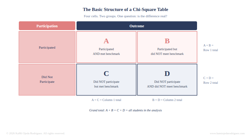
Each cell holds a raw count of students. Chi-square compares what you actually observed in these four cells to what you would expect if participation had no effect on the outcome.
Why does this matter more than most people think
This matters because the same percentage gap can mean completely different things depending on how many students are behind it. While a raw percentage will not account for this difference the Chi-square test do it directly.
Chi-square is one of the simplest statistical tests available, and it is well-suited to the kind of data that education programs generate every day. It does not require specialized statistical software because it can be run in Excel or entered into a free online calculator in under two minutes. The data structure it requires, counts organized into categories, is easily found in program rosters, assessment exports, and/or participation logs. Program managers and coordinators are used to reporting percentages because percentages are intuitive and easy to communicate. But adding this test to that percentage is not a significant additional burden, and it really changes what the finding can claim.
What this test cannot do
Let’s now talk about the limitations to the test. A chi-square will not tell you how large that difference is in practical terms or whether the program caused it.
For practical magnitude, a follow-up measure called Cramer's V can be calculated from the chi-square result. It ranges from 0 to 1 and tells you the strength of the association between the two variables. A Cramer's V of 0.1 is considered small, 0.3 is moderate, and 0.5 or above is strong. This is just one more little step in the analysis that will give you more powerful estimates, and most statistical programs calculate it automatically, and several free online calculators include it alongside the chi-square output.
As with any statistical test, this test can tell you something related to the pattern in the data but it cannot explain why the pattern exists or whether it will replicate in a different context. Those questions require judgment, implementation data, and causal/impact evaluation designs.
All these said about Chi-squares, let me now help you with resources and tools to play with Chi-squares.
Resources for running this test yourself
All of the following are free and require no software installation or statistical training to use.
Online calculators:
• Social Science Statistics Chi-Square Calculator: designed specifically for social science and education researchers, no registration required. Enter your cell counts and it returns the chi-square statistic, degrees of freedom, and p-value. https://www.socscistatistics.com/tests/chisquare/
• GraphPad QuickCalcs: clean interface, widely used, returns the p-value directly. https://www.graphpad.com/quickcalcs/chisquared1/
For Excel users:
• Microsoft official documentation for CHISQ.TEST: syntax and a worked example included. https://support.microsoft.com/en-us/office/chisq-test-function-2e8a7861-b14a-4985-aa93-fb88de3f260f
• DataCamp step-by-step tutorial: running chi-square in spreadsheets, written for non-technical users. https://www.datacamp.com/tutorial/chi-square-test-in-spreadsheets
For conceptual understanding:
• QuantPsy interactive tool: plain-language explanation of the test logic with an interactive calculator. https://www.quantpsy.org/chisq/chisq.htm
The bottom line
Percentages are useful for simple descriptions, if you want a more accurate comparison method, I’d suggest chi-square tests. When you are comparing groups in a program evaluation, knowing whether that difference is likely to be real is what moves the finding from observation to evidence. The test that gets you there is simpler than most people think. And the data to run it is probably already sitting in your files. Give it a try.